Ottawa Philatelic Society
King George V Admiral Issue of Canada
by Tom Meyerhof 16 October 2014 (revised October 2018)
Introduction
King George V ascended to the throne of the United Kingdom on 6 May 1910. The first definitive stamps showing his portrait were issued eighteen months later in December 1911. The long delay was due to the renegotiation of the expired printing contract in 1911 and the time needed to create a suitable portrait. The vignette, a composite with the head taken from one portrait and the chest and uniform from a different painting, was considered at the time the most life-like and the best that had appeared on a postage stamp. The Admiral issue, so called because the portrait depicts the King in the full dress uniform of an Admiral of the Fleet of the Royal Navy, has become one of the most studied areas of Canadian philately This is due to the many ways in which it can be collected and classified. Changes in postal rates and Universal Postal Union (UPU) conventions required new denominations and colour changes. The Admiral issue saw more such changes than during any other definitive issue period since Canada joined the UPU in 1878. The long period of use, until 1928 when the Admiral issue was replaced by the King George V Scroll issue, also necessitated new dies and numerous printing plates, resulting in a wide range of flaws and other varieties for collectors to study. In addition, changes in printing technology during the Admiral era produced further stamp varieties that can be challenging to find.
Production
The Admiral stamps were printed in Ottawa by the American Bank Note Company (ABN) using line-engraving, also known as recess, gravure or intaglio printing. In 1923 the Ottawa facility became a subsidiary of the ABN called the Canadian Bank Note Company (CBN).
The ABN first prepared a master die containing the design elements common to all denominations. The printer next produced a secondary or working die for each value which contained the missing features, primarily the numerals and text for the value. From these working dies the individual printing plates were prepared. The stamps were produced using various plate layouts.
For sheet stock, four different layouts were used as follows:
Type A - two panes of 100 stamps (10 horizontal rows of 10 subjects each), divided by a vertical gutter,
Type B - four panes of 100 stamps (10 horizontal rows of 10 subjects each), divided by vertical and horizontal gutters,
Type C - one pane of 200 stamps, (10 horizontal rows of 20 subjects each), with guide arrows at the top and bottom indicating the division between the tenth and eleventh columns to facilitate separating the sheet into panes,
Type D - one pane of 400 stamps, (20 horizontal rows of 20 subjects each), either without guide arrows or with guide arrows at the top, bottom and on each side of the sheet indicating the location for division between the tenth and eleventh columns and rows.
For all sheet layouts, the printed sheets were guillotined into post office panes of 100 stamps. Depending on the layout, the resultant panes could have straight-edged stamps on 1 or 2 sides.
For the production of booklet panes, four different plate arrangements were used, initially with 168 subjects, but in time larger plates were adopted to increase production speed. Early roll or coil stamps were not printed from special plates, but made from strips cut from perforated sheets and pasted together using the sheet selvedge to produce rolls of 500. Shortly afterwards coil stamps were printed from special coil plates.
Most stamps were printed on unwatermarked, white wove paper of medium thickness. A distinctive type of paper, commonly called thin paper, although it has about same thickness as normal wove paper, but with a distinctive translucent mesh and lattice appearance from the back, was used briefly for some denominations in 1924.
Two methods were used to print the Admiral issue: Initially the wet process was used to print all Canadian postage stamps. With this method the printing is carried out on dampened paper sheets. The gum is applied after the sheets have dried, and the sheets are then cut into panes and perforated. After December 1922 a dry method was introduced with the printing performed on dried, gummed sheets. The advantage of the dry process is printing speed. Wet or dry printed stamps can be distinguished by measuring the horizontal width or vertical height to the edges of the outer frame line of the design. Sheets prepared by the wet method shrink about 0.5 mm when they dry. Thus stamps made by the wet method are narrower than those that are dry printed if vertical wove paper is used, and are shorter if printed on horizontal wove paper. Vertical shrinkage can be found on booklet pane issues that were printed on paper with a horizontal grain. Also, on dry printings the lines of the design appear sharper and the design itself is slightly embossed when viewed from the back as compared to wet printings.
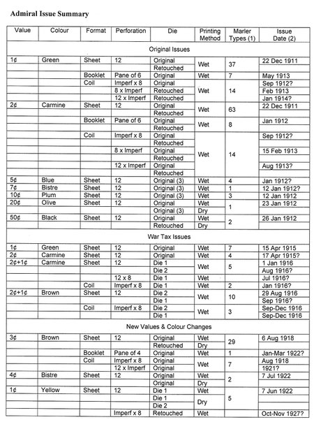
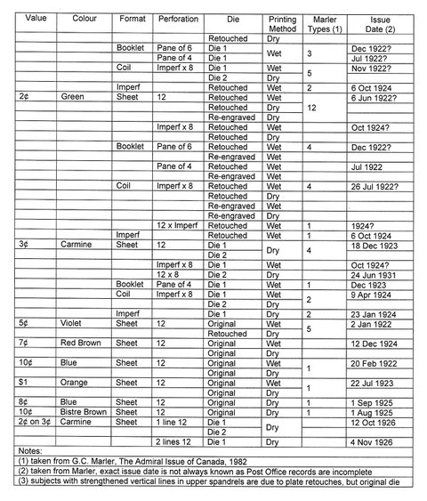
During the 17 years that Admiral stamps were printed, the dies for nearly all denominations were retouched and/or re-engraved. The dies of 1¢ yellow, 3¢ carmine and 1¢ War Tax in carmine and brown were replaced at various times with completely new dies which can be visually distinguished due to small design changes.
Formats
The first Admiral sheet stamps were issued in late 1911 and early 1912. The remaining sheet, booklet and coil stamps were issued at various subsequent dates. The last issue was the 3¢ carmine stamp perforated 12 x 8, printed in 1926 and intended for coil stock. It was issued in 1931 as a provisional stamp to alleviate a brief shortage caused by a postal rate increase, before the 3¢ value of the Scroll design was available at the post office.
All Admiral denominations were available from the post office in sheets of 100 subjects laid out in a 10 x 10 format and line perforated 12. A number of small booklets consisting of panes of 4 or 6 stamps in 1¢, 2¢ and 3¢ denominations were issued at various times starting in early 1912 as a convenience to the public. For the first time beginning in 1912, the 1¢, 2¢ and 3¢ denominations were also issued in horizontal (sidewise) and vertical (endwise) rolls or coils of 500 stamps. The horizontal coils were perforated 8 vertically. The vertical coils were perforated either 8 or 12 horizontally and originally intended for use in stamp vending machines. In 1915 to alleviate a shortage of 2¢ coils, provisional or experimental coils were made from regular sheet stock torn in strips of 10 and pasted together endwise. In 1918 for a brief unsuccessful experiment with stamp vending machines, 1¢ vertical green coils were punched with two additional large holes between each stamp in an attempt to facilitate dispensing from these machines. In addition the 1¢ yellow, 2¢ green and 3¢ carmine were also printed with gum in part-perforate and imperforate sheet format for sale to the public, but were only available from the Post Office Philatelic Agency established in 1923.
Stamp Details
The initial Admiral stamps issued between 1911 and 1917 consisted of the following seven denominations: 1¢ green, 2¢ carmine, 5¢ blue, 7¢ bistre, 10¢ plum, 20¢ olive and 50¢ black. The 3¢ brown (the consolidated war tax rate) was added in 1918, followed by the 4¢ bistre in 1922, the $1 orange in 1923 and the 8¢ blue in 1925.
To help finance World War I, a number of special war tax stamps were issued in various colours in both sheet and coil format to pay the 1¢ tax on first class letters and postcards starting in 1915. These 7 designs, engraved with the words “WAR TAX” or “1T¢” should not be confused with 5¢, 20¢ and 50¢ Admiral stamps overprinted diagonally in black or red and intended as fiscal stamps to pay the war tax on wines and spirits, and not for postal use, although some were used for the latter purpose. When the postal rate changed from 2¢ to 3¢ in 1918, the production of special war tax stamps was discontinued.
The subsequent colour changes for some values were the result of an agreed standardization of postal rates throughout the UPU. When the domestic rate changed to 3¢, its colour as the domestic rate stamp was changed to carmine, while the 1¢ and 2¢ values were changed to yellow and green respectively. The new 10¢ UPU rate required it be changed to blue, which in turn caused the 5¢ denomination to be issued in violet. When the UPU rate changed to 8¢ and a blue colour, the 10¢ value was changed to bistre brown.
|
Denomination |
Purpose |
|
One Cent |
drop letters, post cards and newspapers |
|
Two Cents |
domestic letters and letters to the US, UK, British possessions and Ireland |
|
Three Cents |
domestic letters (including 1¢ war tax) and for a time to the UK, British possessions and Ireland |
|
Four Cents |
increased rate to UK, British possessions and Ireland |
|
Five Cents |
blue - foreign UPU letter rate and registered mail violet - registered mail after foreign rate change |
|
Seven Cents |
registered (5¢) plus domestic rate (2¢) |
|
Eight Cents |
reduced foreign rate after UPU change |
|
Ten Cents |
increments of registration indemnity, foreign UPU rate for a time |
|
Twenty Cents |
increments of registration indemnity and heavier items |
|
Fifty Cents |
increments of registration indemnity and heavier items |
|
One Dollar |
increments of registration indemnity and heavier items |
In 1926, provisional 2¢ stamps were issued by overprinting excess 3¢ carmine sheet stock in black to reflect a reduction in the domestic postage rate. Two versions exist. The work of the government King’s Printer using a one line surcharge was considered unsatisfactory and most production was destroyed, except for 500 sheets retained for sale through the Philatelic Agency, but not post offices. A second attempt by the Canadian Bank Note Co. using a two line surcharge was equally unsuccessful, but about 800 sheets were retained for sale, again only through the Philatelic Agency.
Lathework
Late in 1916, for reasons that remain unclear, the ABN began engraving stamps with an engine-turned pattern called lathework in the selvedge or margins of the stamp sheets. There was a problem with getting enough ink on the plates in the latter years when wet printing was used. It is possible that the practice was introduced to give an indication of the quality of the printing of the sheets when they were inspected. Another explanation refers to the lathework as hold down strips with ink in the recesses of the design preventing the paper from lifting from the cylindrical printing plate before the first row of stamps was printed. The practice ceased during the switch from wet to dry printing beginning in 1923. Four different basic designs of lathework were used, known as Type A, B, C, and D, as well as inverted versions and some varieties. Most Admiral denominations issued in sheet form can be found with lathework.
Precancels
Precancelled stamps are stamps that have been cancelled with an overprint before being sold by the post office. They were only available at certain post offices for bulk mailings to reduce post office handling and shorten delivery time. The early designs starting in 1889 consisted of straight or wavy lines and are known as bar style precancels. The printing of bar style precancellation overprints on the Admirals began in late 1912 and they were applied to 11 different Admiral stamps. Starting in 1903, precancel designs began to change to include the town and province in order to identify the point of mailing. These are known as city or town styles. A total of 87 different city types exist on Admiral stamps, including a number of different types for some cities, and they can also appear inverted, doubled and in other varieties. The post office reverted to the bar style in 1922. A few Admiral stamps were also issued in Montreal, Toronto and Winnipeg in 1931 using a MOON (Money Order Office Number) number between pairs of bars.
Perforated Initials
For a time to discourage theft by their employees, companies and government departments perforated their stamps with initials or insignia. Stamps that have such perforations are often referred to as “perfins”, the abbreviation for perforated initials. Private companies started this practice in 1887, individual federal and provincial government departments followed, while the federal government as a whole began perforating stamps with the letters OHMS (On His Majesty’s Service) beginning in 1923, with the letters H and M having 5 holes in each vertical leg. These are commonly called 5 hole perfins to distinguish them from the later 4 hole style adopted in 1939. OHMS perfins can be found in 8 different orientations depending on how the sheets were fed into the perforating machine. Varieties also exist such as double, triple or compound perforated stamps if the sheet was inadvertently perforated more than once, and with the missing pin in the S of OHMS after it broke off in one position on the perforating machine. As well as with the federal government 5 hole OHMS, Admiral stamps exist with perfins from more than 70 companies.
Flaws
A stamp flaw refers to any blemish on the printed stamp. Flaws can be recurring or non-recurring. A recurring or constant flaw, also known as a plate flaw or variety, is one that appears in the same position on each sheet of an issue and is caused by some defect in the plate used to print the stamps. Plate flaws may not be truly constant as for example a scratch which may occur at some point during the printing and may then wear off with use or be repaired if noticed while the plate is in use. Non-recurring flaws, also known as inconstant or non-constant flaws, are those that happen by chance. They can occur during the printing process in the form of plate inking anomalies such as ink smears, paper folds or creases, or from the presence of dust, paper fragments or other foreign matter that results in imperfections or unprinted areas on the printed design. Numerous flaws such as random dots, dashes, lines and ink smears can be found on every value of the Admiral issue. These should not be confused with hairlines caused by plate cracks or other constant plate varieties.
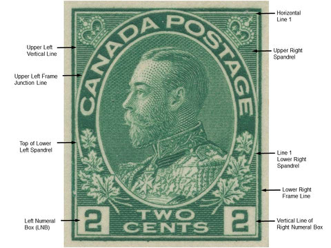
Terminology
When studying the
Admiral stamps in detail using literature references, specialized terminology is frequently used. Some of these terms are briefly described
below. Other terms related to the design elements of the stamp are illustrated on the subsequent page.
Type or design type: “a set of characteristics visible
on a stamp, usually caused by changes to the die or by relief breaks on the transfer roll, common to a group of subjects on a significant part of one or more plates, which serve to identify the
stamp as coming from a particular plate or group of plates.” (6)
Relief break: short line segments missing or distorted on the printed stamp as a result of tiny metal fragments breaking off the raised ridges of the transfer roll used to impress the stamp design onto the printing plate.
Re-entry: a constant plate variety that results in portions of the design being doubled. It occurs in the same position on every sheet printed from the plate usually as the result of the steel transfer roll being impressed more than once, but slightly out of registration on the plate from which the stamps are printed.
Retouch: a visible irregularity such as a wider, narrower, or wavy line segment or unintended line deviation caused by hand engraving specific lines, often in a spandrel or numeral box on individual plate positions, to strengthen part of the stamp image before printing.
Some Admiral Terms Illustrated
Collecting Admiral Stamps
Since over 15 billion Admiral stamps were produced, mint and used copies are readily available, although some varieties can be amazingly scarce and a challenge to acquire. For a general collection, the Admiral stamps are often simply displayed according to catalogue number as sheet and coil singles, in either used or mint condition.
Including colour changes, there were just 22 basic designs, but with booklets, coils, new and modified dies, over 700 plates, overprints, new printing techniques and postal rate changes, there is a wealth of possible material to collect and study. The serious collector of Admiral stamps will require considerable time and knowledge to make an in-depth study and create a satisfying specialized collection. The specialist can collect, research and display stamps using criteria such as:
- shade variations
- cancellations on used copies
- official and private perforated initials
- precancelled stamps with and without perforated initials
- booklets, booklet pane and varieties
- coil types and varieties
- normal and thin experimental paper where used
- plate varieties caused by retouches and re-entries
- plate inscriptions, guide arrows and other marginal markings
- lathework where present
- varieties exhibiting hairlines, plate scratches, guidelines and guide dots
- non-constant printing varieties such as paper creases, ink smears, kiss prints, perforation shifts, and mis-cut sheet stamps, booklet panes and coils
- design types for various denominations
Consider as an example the collection of shade variations for the basic 1¢ to $1 denominations. While a standard catalogue such as Stanley Gibbons identifies a total of 35 different shades, the Unitrade catalogue lists 64 shades, and The Color Guides for the Admiral Issue by Richard Morris has colour chips representing 68 common shades found in catalogues and other publications for these same stamps. While each of these sources has some shade name inconsistencies, for a given stamp, each shade can range from light to dark, pale to deep, and dull to bright when viewed under a full spectrum light source. With the advent of World War I, the German source for dyes used in the printing inks was cut off, and so other suppliers and ink formulations were used, which further increases shade variations. A number of the carmine (red) coloured stamps printed after about 1916 also exhibit fluorescence and are sometimes printed with aniline inks as a result of these changes, adding further complexity. It can thus be a significant challenge to create a comprehensive collection of the shades for all the basic denominations using well-centred mint or pleasingly cancelled used stamps.
Further Reading
(1) Marler, George C., The Admiral Issue of Canada, American Philatelic Society, State College PA, 1982
(2) Reiche, Hans, Canada, The Admiral Stamps of 1911 to 1925, Parts I & II; 1965, 1971
(3) Reiche, Hans, Canada, The Admiral Flaws, 1987
(4) Morris, Richard M., Color Guides for the Admiral Issue of Canada, Pittsboro Philatelics, Norfolk MA, 2000
(5) Brown, Tony & Burn, Mike, The Admiral Stamps of Canada,
website: http://www.rpsc.org/Library/admiral/admiral.htm
(6) Van Someren, Randall W., Guide to the Admiral Stamps of Canada, website:
http://www.bnaps.org/ore/VanSomeren-AdmiralStamps/VanSomeren-AdmiralStamps-Intro.htm
(7) Lundeen, Glen, The Admiral Issue, website:
http://www.dglphilatelics.com/admiral.html